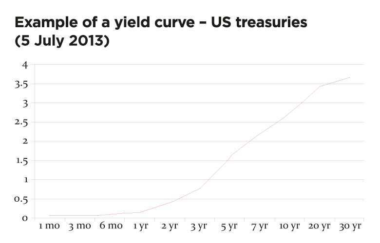
A yield curve is simply a graphical display of interest rates in the market for different periods of time. While simple in concept, they have enormous value given what they say about an economy, and therefore provide useful information to treasurers. This is an example of a yield curve, based on real data:

In this example, the yield on US treasuries rises as funds are invested for longer. It is an ‘upward-sloping’ yield curve and its broad shape is usually considered to be the ‘normal’ yield curve. This is because it implies that interest rates should rise over time, indicating a healthy economy, as well as offering some reasonable reward to long-term investors against inflation and illiquidity. There are several other ‘shapes’ that the yield curve can take.
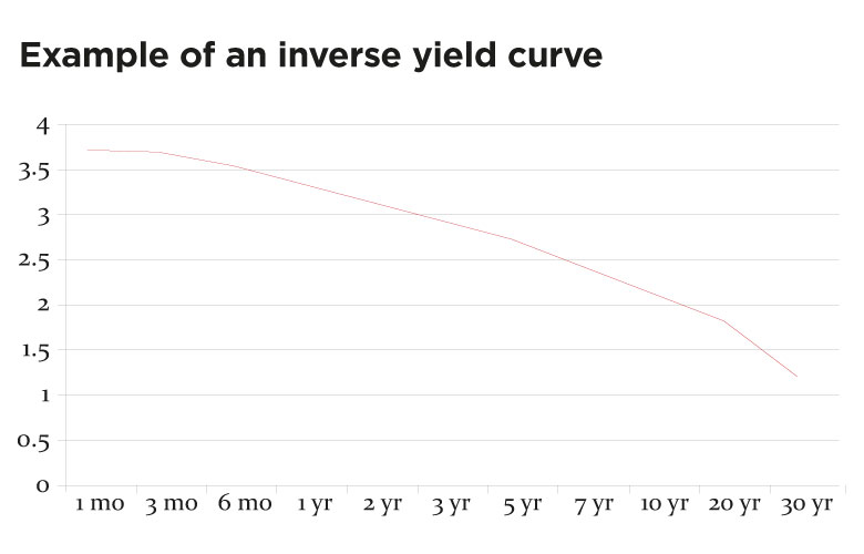
An ‘inverse yield curve’ looks like this, based on fictitious data:

This is less common, but indicates that rates are expected to decline over time, suggesting a slowing economy.
There are, of course, many shapes that a curve can take and perhaps the other important one is a ‘humped’ yield curve, which has been common in the UK.
This predominantly upward-sloping curve has a dip at the far end, probably because of large purchases of long-dated gilts by pension funds. These purchasers, hedging their long-term liabilities, raise gilt prices and push yields down.
To complicate things, yield curves can be drawn from different instruments, such as Libor rates or swap rates, government securities, nominal instruments to give a nominal curve, or data from inflation-linked instruments to give a real curve. A further complication is that for any instrument there are actually three interest rates for any period:
In an upward-sloping yield curve, the forward rate is higher than the zero coupon rate, which in turn is higher than the par rate.
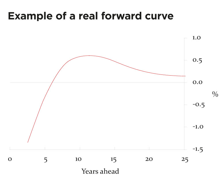
The following is an example of a real forward curve and shows the current negative real interest rates in sterling. It also shows that the market expects the rate to become positive in about five years’ time. Implied negative real rates can indicate expectations of future deflation.

There is an enormous amount of information in a yield curve that the treasurer needs to be able to interpret. The information is there because of market transactions – supply and demand has generated the curve. The forward information is the market’s best guess for the future and there are two things the treasurer should understand:
Information of particular interest to treasurers in the yield curve includes:
Interest rate fixing or unfixing decisions have a greater immediate impact on the interest bill when the curve is steep. Many treasurers consider yield curves as one of the most important pieces of market information that they should have available and understand.
Will Spinney is associate director of education at the ACT
